Creating The Reading Archive has been a process of slowly turning an idea into something that feels like an actual product. I started with the idea of creating a digital reading journal because I wanted one place where readers could keep track of their books, TBR, ratings, goals, and reading stats. After designing and testing the product itself, this week was about figuring out how I would actually sell it.
Before this assignment, I thought of a sales page as mostly a place to show a product, explain what it includes, and give someone a button to buy it. After researching and creating my own, I realized there is a lot more strategy behind it. A sales page has to take someone who knows very little about your product and give them enough information to understand what it is, why they need it, and what they should do next.
Starting With the Value, Not Just the Product
One of the biggest things I learned was that the top of a sales page has to communicate the value of the product almost immediately. HubSpot explains that an effective landing page should have a compelling headline and a clear call-to-action while keeping the page focused on one main goal (Shea, 2026).
This made me rethink how I introduced The Reading Archive. Instead of making the biggest headline something simple like “The Reading Archive,” I used “Your Entire Reading Life All in One Place.” Underneath, I explained that it is a customizable Notion reading journal for tracking books, ratings, goals, stats, and reading memories.
I think this works better because someone doesn’t even have to know what The Reading Archive is yet to understand what it could do for them. The product name is important, but the reason someone would want the product is even more important.
Features Are Only Half of the Story
Another part of creating the page that stood out to me was learning the difference between simply listing features and actually explaining their benefits. Unbounce describes a feature as something a product has, while a benefit explains the positive impact that feature can have for the customer (Unbounce, n.d.).
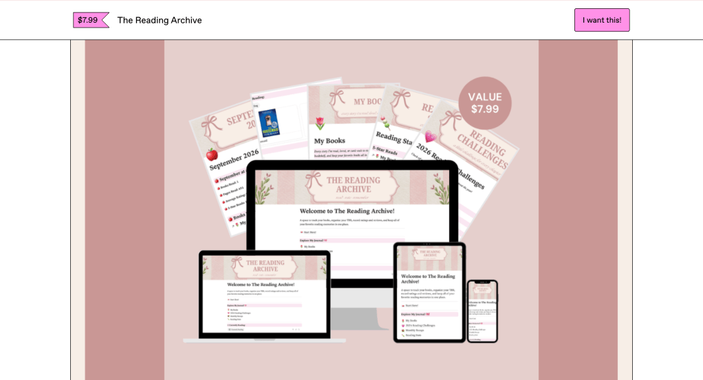
This was especially relevant to my product because The Reading Archive has a lot of features. It includes a My Books database, TBR tracker, reading challenges, monthly recaps, reading stats, and individual pages for each book. I could have just listed all of those things and stopped there, but that would not necessarily explain why someone should care about them.
For example, the Reading Stats section is a feature, but the benefit is being able to easily look back at your reading progress and habits without having to track everything manually. The Monthly Recaps are a feature, but they also give readers a way to remember what they read, how much they read, and what books stood out to them each month. Thinking about the product this way helped me write the sales page from the perspective of the person who might actually buy it.
Designing for Someone Who Is Scrolling
The visuals were another part of the sales page that I put a lot of thought into. I knew I didn’t want the page to just be a giant block of text explaining everything. HubSpot recommends keeping landing pages simple and using clear messaging and design to guide visitors toward one specific action (Shea, 2026).
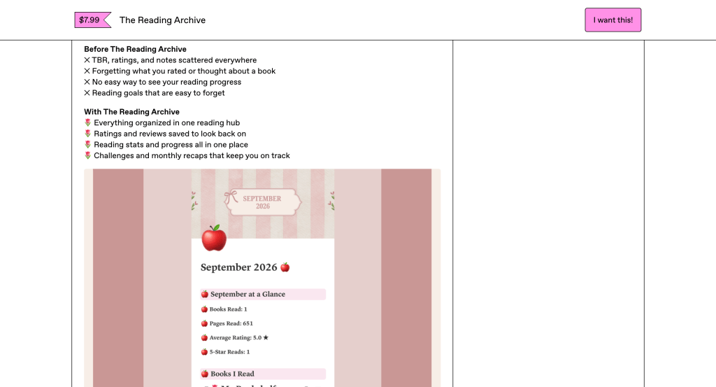
Because of that, I broke the page into smaller sections and used screenshots of the actual journal throughout it. I included examples of the My Books page, Reading Stats, and a Monthly Recap. This gave me a way to show what I was talking about instead of expecting someone to imagine the product based only on my descriptions.
I also kept the same soft pink and bookish style that I had already created for The Reading Archive. I wanted the sales page to feel connected to the product instead of looking like a completely separate project. Since my target audience is readers who enjoy organizing and personalizing their reading experience, I think the visual style is also part of communicating who the product is for.
Keeping One Goal in Mind
Even though the page has a lot of information, everything ultimately leads to one action: purchasing The Reading Archive for $7.99. Unbounce explains that landing pages should be designed around a single conversion goal and that the call-to-action should clearly tell visitors what they should do next (Unbounce, n.d.).
This helped me understand why every section needed to have a purpose. The problem section shows why someone might need the product. The features show what they are getting. The “Before” and “With The Reading Archive” sections show the difference the product could make. The FAQ answers questions someone might have before purchasing. Finally, the page ends by bringing the reader back to the main idea behind the product: having their entire reading life organized in one place.
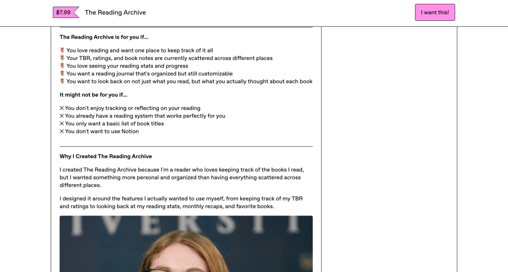
I also liked adding a section explaining why I created The Reading Archive. This product came from something I would genuinely want to use as a reader. I love keeping track of what I read, but I wanted something that could hold more than just a list of book titles. Adding that personal piece made the page feel more like my product rather than just an assignment I was trying to sell.
What I Learned From Building the Page
The biggest thing I took away from this process is that creating a product and selling a product require two different ways of thinking. When I was building The Reading Archive, I was focused on whether the databases worked, what information readers could track, and what I personally wanted the journal to include. When I started building the sales page, I had to switch perspectives and think about how someone seeing it for the first time would understand its value.
That shift made me look at my product differently. Instead of only asking, “What does The Reading Archive include?” I had to ask, “Why would someone want this?” That question affected everything from the headline and screenshots to the way I described individual features.
The final sales page feels like the point where The Reading Archive went from being a Notion template I created for class to something that could actually exist as a digital product. There are still things I could test and improve if I were selling it to a larger audience, but creating the page gave me a much better understanding of how design, copy, visuals, and strategy all work together to turn an idea into an actual offer.
Citations
Shea, P. (2026, May 18). 7 best practices for highly effective landing pages. HubSpot. https://blog.hubspot.com/blog/tabid/6307/bid/6014/7-habits-of-a-highly-effective-landing-page.aspx
Unbounce. (n.d.). The anatomy of a landing page. Unbounce. https://unbounce.com/landing-page-articles/the-anatomy-of-a-landing-page/


Leave a comment