
If there’s one thing I love, it’s going to concerts. There’s genuinely nothing better than finding out your favorite artist is going on tour, looking at the dates, and immediately trying to figure out how you’re going to get tickets. But as exciting as that sounds, anyone who has ever tried buying concert tickets online knows that the process isn’t always as fun as the concert itself.
Between waiting in virtual queues, watching tickets disappear right in front of you, and realizing the total is way more expensive than you originally thought, buying concert tickets can be stressful. And honestly, sometimes getting the tickets feels like an accomplishment on its own.
For this week’s assignment, I wanted to take something I’m already familiar with and look at it from a UX perspective. I decided to create a user journey map following the experience of someone trying to purchase concert tickets online. I wanted to see how something that’s supposed to be exciting can quickly become frustrating, and what could be done to make the experience better.
What Even Is a User Journey Map?
Before this assignment, I understood that UX design was about making products easier and more enjoyable to use, but journey mapping helped me look at that idea a little differently.
A user journey map is basically a visual breakdown of the steps someone goes through when interacting with a product or service. It doesn’t just focus on what they’re doing, but also what they’re thinking, how they’re feeling, and what problems they might run into along the way. According to the Interaction Design Foundation (2025), journey maps help designers visualize a user’s experience by looking at their actions, thoughts, emotions, and interactions throughout the process.
What I found interesting is that the user’s emotions are just as important as their actions. Someone could technically accomplish everything they needed to do on a website, but that doesn’t necessarily mean they had a good experience.
Journey mapping allows designers to look at the bigger picture and figure out where users might be struggling, even if they’re ultimately able to complete their goal.
My Persona, Sophie
For my journey map, I created Sophie Martinez, a 21-year-old college student who loves going to concerts.
Sophie finds out that her favorite artist is going on tour and immediately wants to buy two tickets. The only problem is that she’s a college student with a budget, and she wants to make sure she’s getting good seats without spending an unreasonable amount of money.
Her goal is pretty simple. That is to find affordable tickets, purchase them successfully, and make sure they’re legitimate.
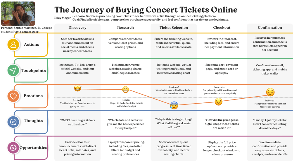
I broke Sophie’s experience into five stages: discovery, research, ticket selection, checkout, and confirmation.
Breaking Down the Ticket-Buying Experience
Discovery: The Best Part
This is easily the most exciting part of the entire experience.
Sophie is scrolling through social media when she sees that her favorite artist has announced a tour. Obviously, she’s excited and immediately starts looking at the dates to see which shows are closest to her.
At this point, everything is pretty positive. She’s not thinking about ticket prices or virtual queues yet. She’s just excited about the possibility of seeing her favorite artist live.
One thing that could make this stage even better is having all the important information available in one place, like tour dates, ticket sale times, and direct links to official ticketing websites.
Research: Trying to Find the Best Option
Once the initial excitement wears off a little, Sophie has to start thinking realistically.
Which show should she go to? How much are tickets going to cost? Are the cheaper seats even worth it?
This is where she’s comparing venues, looking at seating charts, and trying to figure out what works best for her budget.
I think one of the biggest frustrations with buying tickets is not always knowing how much you’re actually going to spend until you’re further into the process. Having clearer pricing and better filtering options would make researching tickets a lot easier.
Ticket Selection: Where Everything Goes Wrong
If you’ve ever sat in a virtual queue waiting to buy concert tickets, you probably know exactly how Sophie feels during this stage.
She’s finally on the ticketing website, but now she has to wait for her turn. And once she gets through, there’s the pressure of finding seats before someone else buys them. This is where her excitement starts turning into anxiety. Ticketmaster (n.d.) explains that its virtual queue doesn’t guarantee tickets, even if you’ve successfully joined the line. I think that uncertainty is a huge part of what makes buying concert tickets so stressful.
I feel like so much of the stress comes from not knowing what’s going on. How much longer is the queue? Are there even tickets left? Is the website going to refresh and make her start all over again?
Something as simple as more accurate queue updates and clearer ticket availability could make this stage feel a lot less overwhelming.
Checkout: Why Is It That Expensive?
Sophie finally finds tickets she likes, and for a second, everything seems to be working out. Then she gets to checkout.
Suddenly, the total is higher than she expected because of additional fees. Now she has to decide whether she wants to spend the extra money, all while feeling like she’s running out of time to complete her purchase.
Personally, I think this is one of the most frustrating parts of buying tickets online. You go into the process with a budget in mind, only to realize the actual total is different from what you originally saw. The Federal Trade Commission (n.d.) has actually introduced rules requiring ticket sellers to show mandatory fees upfront. I think this really shows how important pricing transparency is, especially when users are making purchases under pressure.
Displaying the full price earlier would make such a difference. Users should be able to make decisions based on what they’re actually going to pay instead of being surprised at the very end.
Confirmation: Finally!
After all of that, Sophie successfully purchases her tickets. She gets her confirmation email, checks that the tickets are in her account, and can finally relax. Now she can go back to being excited about the concert instead of stressing over whether she’s actually going to get there.
This stage might seem simple, but I think it’s really important. After spending so much time and money on tickets, users want reassurance that everything went through correctly. Having an immediate confirmation and easy access to tickets can make the entire experience feel a lot more secure.
What I Learned From Mapping This Journey
I think the biggest thing I took away from this assignment is that a successful outcome doesn’t automatically mean a successful user experience.
Sophie gets her tickets in the end, which means she technically accomplished her goal. But when you look at everything she went through to get there, there are so many moments where the experience could have been better.
What stood out to me the most was the emotional side of the journey. She starts out excited, becomes hopeful while researching, feels anxious during ticket selection, gets frustrated at checkout, and finally feels relieved once everything is confirmed.
Seeing those emotions mapped out made it easier to understand where the biggest problems were happening. The Interaction Design Foundation (n.d.) emphasizes that journey mapping helps designers identify pain points and opportunities for improvement by examining the experience from the user’s perspective. I think that’s exactly what made this assignment so interesting to me.
It also made me realize that sometimes small changes can have a huge impact on how someone experiences a website. Something like showing the full price upfront or giving more accurate queue information might not seem like a major change, but it could make the entire process feel less stressful.
Since Sophie is a fictional persona, this map is an example based on common ticket-buying experiences rather than a formal user study. Still, creating it helped me practice looking at a familiar process from the user’s perspective.
Final Thoughts
Going into this assignment, I knew that buying concert tickets could be stressful. I’ve experienced enough ticket sales to know that sometimes the process feels way more complicated than it needs to be.
But actually breaking down the journey helped me understand why certain parts are so frustrating and how UX design could help fix them.
I think that’s what I liked most about this assignment. It took something I genuinely enjoy and allowed me to look at it in a completely different way.
At the end of the day, buying concert tickets should be exciting. You should be worrying about what you’re going to wear, what songs are going to be on the setlist, and how early you need to get to the venue, not whether the ticketing website is going to cooperate.
And if there’s one thing this journey map made clear, it’s that getting the tickets shouldn’t be the hardest part of going to a concert.
Citations
Federal Trade Commission. (2025, May 1). The rule on unfair or deceptive fees: Frequently asked questions. https://www.ftc.gov/business-guidance/resources/rule-unfair-or-deceptive-fees-frequently-asked-questions
Interaction Design Foundation. (n.d.-a). Customer journey map. https://www.interaction-design.org/literature/topics/customer-journey-map
Interaction Design Foundation. (n.d.-b). Customer journey maps—Walking a mile in your customer’s shoes. https://www.interaction-design.org/literature/article/customer-journey-maps-walking-a-mile-in-your-customer-s-shoes
Ticketmaster. (n.d.). What is the queue and how do I join? https://help.ticketmaster.com/hc/en-us/articles/9781366115985-What-is-the-queue-and-how-do-I-join


Leave a Reply