
Color is one of the first things people notice when it comes to a brand, and probably the most influential tool it has, as well. That is because before consumers interact with the brand’s text, message, or narrative, the color establishes the immediate emotional tone and what to expect from the brand. The logos, packaging, user interfaces, and even the advertising campaigns they create tend to rely on color to display it’s unique personality, mood, and values within seconds. In visuals that feel a bit crowded, brands tend to rely heavily on color to create fast emotional connections and help remember it’s identity (Lupton, 2017).
To reinforce these approaches, designers and advertisers often rely on emotional frameworks that are easy to understand and use. One of the most commonly used models is Plutchik’s Wheel of Emotions, which is a map of emotions based on intensity and proximity, using color as a visual reference (Plutchik, 2001; Interaction Design Foundation). In branding, the wheel is often treated as a tool for adding emotional meaning to color choices, even though this use tends to simplify the model and overlook its original purpose (Cao, 2015; Jin et al., 2019).
With that being said, research in color psychology, emotional design, and branding complicate this. Emotional reactions to color are not static or universal, but they are influenced by context, saturation, cultural background, and learned associations (McLeod, 2018; Bushe, 2019). Peer-reviewed research indicates that the hue in the color alone rarely dictates emotional response. It’s the emotional significance that typically emerges through narrative context, repetition, and personal experience (Suk & Irtel, 2010). As a result, color emotion systems often fail to reflect how consumers actually perceive and interpret brand visuals.
This paper examines how brands incorporate color-emotion frameworks, such as Plutchik’s Wheel of Emotions, into their visual identity systems. By analyzing multiple colors from the wheel and comparing brands where emotional colors are effective with those where it becomes inconsistent or problematic, the discussion shows both the strengths and limitations of color-based emotional models. By drawing from branding research and color psychology, it argues that color functions less as a fixed emotional signal and more as something that strengthens meaning created through different contexts and experiences (Norman & Ortony, 2003).
Plutchik’s Wheel of Emotions and Its Appeal to Brands
Plutchik’s Wheel of Emotions was developed as a conceptual model illustrating emotional relationships, oppositions, and intensities (Plutchik, 2001). Emotions are arranged in opposite pairs (light to dark), with the intensity increasing as one moves outward from the center. Color is used to visually enhance emotional proximity and blending, implying that emotions, just like colors, can merge to generate more complex states (Interaction Design Foundation).
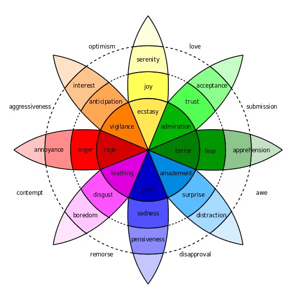
Source: Interaction Design Foundation
Plutchik’s wheel is popular among brand professionals because of its simplicity and visual clarity. Emotional branding relies on differentiation and consistency, and Plutchik’s wheel looks to provide an organized approach to emotional positioning (Norman & Ortony, 2003). When used, the wheel can aid in determining emotional tone and narrative direction.
Problems come up when the colors of the wheel are read as universal emotional indications, because of the fact that Plutchik did not intend the colors to be seen as fixed emotions. However, in branding, the model is frequently used for color-emotion principles that disregard cultural variance, perceptual context, and brand storytelling (Plutchik, 2001; McLeod, 2018).
Brand Use of Color Aligned with Plutchik’s Wheel of Emotions
Plutchik’s Wheel of Emotions organizes emotional experience into eight primary emotions of joy, trust, fear, surprise, sadness, disgust, anger, and anticipation. Each one of these emotions are represented by a distinct color (Plutchik, 2001). When brands attempt to use color emotionally, they often draw from these color associations, whether intentionally or not. When brand samples are examined using the wheel, it becomes clear where emotional color use fits Plutchik’s wheel and where it doesn’t.
Red As Rage, Anger, and Annoyance
On Plutchik’s wheel, red corresponds to high emotions such as anger, rage, and annoyance. In branding, red is often used to provoke urgency and attention rather than literal anger (Suk & Irtel, 2010; Suk et al., 2004).
When It Works Example: Coca-Cola

Source: Coca-Cola
Coca-Cola’s red branding does not evoke anger, but instead, it channels the high emotion associated with vigilance into excitement and emotional intensity. Research in Color Research & Application demonstrates that red heightens physiological emotional arousal, but emotional interpretation depends on the framing of the context (Suk & Irtel, 2010). Coca-Cola’s long run use of celebratory images and social narratives redirects that angry emotion toward joy, showing how brands can reshape emotional outcomes beyond the wheel’s literal labels (Local Measure, 2018; Pine & Gilmore, 1999).
When It Doesn’t Follow Example: YouTube

Source: YouTube
YouTube’s use of red more closely aligns with anger, but in a negative sense. Notifications, alerts, and interface cues create a persistent sense of urgency, which users often experience as a feeling of stress or overstimulation. This example demonstrates how red can unintentionally activate emotional vigilance rather than positive engagement, revealing the limits of assuming emotional control through color alone (Bushe, 2019).
Yellow As Serenity, Joy and Ecstasy
The color yellow on the wheel represents serenity, joy and even ecstasy. Brands often use yellow to communicate happiness and a feeling of approachability.
When It Works Example: McDonald’s

Source: McDonald’s
McDonald’s iconic yellow displays feelings of joy and familiarity through long-term repetition and consistency of the color. Rather than producing ecstasy, the color reinforces mild, accessible happiness aligned with the consumption of their products. This aligns with branding research showing that emotional meaning is learned over time rather than ingrained to color.
When It Doesn’t Follow Example: Snapchat

Source: Snapchat
Snapchat’s highly saturated yellow color aims to signal joy and playfulness, but for some users it produces a sense visual strain or irritation. Research on saturation suggests that intense yellow can increase this feeling to uncomfortable levels, causing emotional responses closer to annoyance rather than joy. This demonstrates how Plutchik’s emotional categories can’t be assumed to function the exact same across different brands (Suk & Irtel, 2010).
Green As Trust, Acceptance, and Admiration
The color green on Plutchik’s wheel corresponds to the feelings of trust, acceptance, and even admiration.
When It Works Example: Starbucks

Source: Starbucks
Starbucks’ green branding reinforces trust and acceptance through calm environments, ethical messaging, and consistent customer experiences. The emotional meaning emerges not from shades of green alone, but from the alignment between visual identity and the experience the consumers get (Pine & Gilmore, 1999).
When It Doesn’t Work Example: BP

Source: BP
BP’s green branding attempts to evoke a feeling of trust and acceptance, but environmental controversies undermine these emotions. This shows that emotional color strategies fail when visual symbolism conflicts with brand behavior, reinforcing emotional design theory that experience overrides aesthetics (Norman & Ortony, 2003).
Blue As Grief, Sadness, and Pensiveness
On the wheel, blue corresponds to grief, sadness and even pensiveness. They do not correspond to trust as commonly assumed in a lot of other branding discussions.
When It Works Example: Tumblr

Source: Tumblr
Tumblr’s use of deep blue tones aligns closely with Plutchik’s association of blue with pensiveness and sadness. As a platform centered on personal expression, creativity, and vulnerability, Tumblr’s color palette supports a solemn, reflective emotional atmosphere. Rather than attempting to make users feel excitement or positivity, the blue interface reinstates emotional depth and focus on the inside, encouraging users to linger, reflect, and engage with emotionally resonant content (Plutchik, 2001; McLeod, 2018).
When It Doesn’t Work Example: Facebook

Source: Facebook
Facebook’s reliance on blue to signal trust contradicts Plutchik’s association with sadness. While blue may be more lively of a color, its emotional meaning is shaped more by usability and habit than by emotional resonance, revealing a disconnect between the theory and it’s actual practice (Bushe, 2019).
Purple and As Boredom, Disgust, and Loathing
The different shades of purple on Plutchik’s wheel are associated with boredom, disgust and even the extreme feeling of loathing. These are emotions that are rarely embraced in branding, but are important nonetheless. Since most brands aim to encourage positive engagement and emotional connection, emotions like boredom or disgust are usually avoided because they can create discomfort or weaken brand appeal.
A Questionable Example: Yahoo

Source: Yahoo!
Yahoo’s purple branding doesn’t connect with feelings in a clear way, so it creates confusion instead of purposeful emotional signals. This reflects why brands often avoid colors tied to negative emotional states on the wheel, like purple.
This avoidance shows a big problem with Plutchik’s branding model that not all categories of emotions are equally useful or desirable in designs that are meant to be seen by customers.
What This Reveals About Plutchik’s Wheel / Branding
When all put together, these brand examples demonstrate that emotional color use in branding is highly selective and depends a lot on the context it’s being used in. While Plutchik’s Wheel of Emotions functions effectively as a conceptual model for understanding emotional relationships and intensity, its specific color and emotion pairings do not always translate cleanly when it comes to branding. Brands come to acquire certain emotional cues while rejecting others, reshaping or overriding color associations through a certain narrative they want to portray, repetition, and even consumer experience (Valdez & Mehrabian, 1994).
This difference between theory and practice is backed by empirical study. Research published in the article “Color Research & Application” show that context, brightness, and saturation have a greater impact on emotional reactions to color than the hue alone (Suk & Irtel, 2010). Research done by APA PsycNet suggests that emotions are not fixed categories but change depending on the situation and context. This makes it difficult to rely on fixed color and their assign meanings to predict emotions.
Brands that succeed emotionally do not depend on fixed color-emotion rules. Instead, they use color along with storytelling, cultural context, and consistent brand experiences to shape the emotional meaning. In this context, color acts as an emotional modifier instead of a established signal. While Plutchik’s Wheel is useful for understanding emotion, its use in branding works best when it is applied in a flexible and interpretive way (Lupton, 2017; Pine & Gilmore, 1999).
Why Color-Emotion Strategies Could Either Succeed or Fail
Although some color-emotion frameworks assume that color alone can predict emotional response, brand examples show that emotional meaning depends on how color is used alongside storytelling and consumer experience. This helps explain why similar colors can lead to very different emotional outcomes across brands.
For example, with Coca-Cola, the famous color red functions as an emotional amplifier rather than a steady emotional signal. According to Plutchik’s wheel, red is associated with high emotions such as anger or rage. Coca-Cola’s branding avoids these interpretations by consistently embedding red within narratives of celebration, nostalgia, and even togetherness. Seasonal campaigns, like holiday advertisements and the images of family or friends sharing a meal together, reinforce positive emotional associations through repetition. Other color psychology research supports this approach, demonstrating that emotion inducing colors like red do not determine emotional strength, but instead the strength is assigned through context (Suk & Irtel, 2010). Coca-Cola’s success lies in its ability to direct emotional arousal toward culturally shared emotional meanings and moments.
On the other hand, YouTube’s use of the color red puts into perspective how color-emotion strategies can change when it comes to digital environments. While the shade increases visibility and engagement, its constant presence in notifications, and the interface can intensify feelings of urgency, and because of this, red no longer signals excitement but contributes to emotional fatigue. This opposition in the same color demonstrates an important limitation of applying Plutchik’s model all the same. It displays that the same color may produce different emotional outcomes depending on platform design and user behavior.
Similar contrasts appear in the use of the different shades of yellow seen in McDonald’s and Snapchat. McDonald’s yellow supports emotional accessibility through long-term familiarity and consistency, particularly within the physical restaurant itself. Snapchat’s yellow, on the other hand, operates in a fast-paced digital environment where brightness and saturation may be perceived as intrusive rather than playful, similar to what happens with YouTube. Studies on saturation and brightness in suggests that high-intensity colors increase stronger emotions, which can be interpreted positively or negatively depending on the context. These findings explain why yellow functions effectively in one brand environment but inconsistently in another.
Green branding further demonstrates the importance of experiential authenticity. Starbucks’ use of green aligns with consumer expectations around comfort and ethical consumption, which helps build emotional acceptance for the brand. BP’s green branding, however, shows how visual symbolism can fail when it conflicts with public perception. When brand behavior doesn’t support the visual message it’s trying to convey, the emotional meaning breaks down, reinforcing the idea that experience often matters more than image itself.
Across these examples, it becomes clear that Plutchik’s Wheel of Emotions works best as a conceptual starting point rather than a strict branding tool. Brands that succeed emotionally use color to support storytelling and consistent experiences, while those that struggle reveal the risks of relying on color symbolism without enough context.
The Role of Cultural Context and Consumer Experience in Emotional Color Interpretation
An important limitation of color-emotion frameworks such as Plutchik’s Wheel is the idea that emotions are universal. Research in color psychology and branding suggests that emotional responses to color vary based on someone’s culture and personal experience, which complicates how global brands use color to communicate emotion (Suk & Irtel, 2010).
Studies also show that cultural background plays a major role in how people emotionally respond to color. A color that creates positive associations in one culture may carry neutral or even negative meanings in another. For example, white is often linked to purity and simplicity in Western branding, like in Apple’s minimalist branding, but in other cultural traditions it can represent mourning or loss. These differences make it difficult to apply universal color-emotion systems to international branding strategies.
Consumer experience also shapes how people emotionally respond to color. Research suggests that these associations are learned over time through repeated brand exposure rather than being inherent to the color itself (Gao & Xin, 2019). As a result, certain colors often become associated with specific industries, such as purple in fashion or orange in food and beverage branding.
Source: Medium
Negative consumer experiences can also outweigh a brand’s intended emotional messaging. In cases like BP, emotional color strategies don’t work well when visual symbolism conflicts with public perception or user experience, reinforcing the idea that emotional meaning comes from interaction and experience rather than color alone (Norman & Ortony, 2003).
From a design perspective, this suggests that color should be treated as a flexible part of an emotional system rather than a fixed emotional trigger. Designers and advertisers need to consider certain factors such as audiences, cultural meanings, and overall brand experiences when using emotional color frameworks. While Plutchik’s Wheel of Emotions remains useful for understanding emotional relationships, its color associations work best when adapted to specific branding contexts instead of being applied universally.
Ultimately, emotional branding is most effective when color supports the brand’s story and reinforces the overall consumer experience. By recognizing the cultural and contextual factors that shape color perception, brands can move beyond oversimplified emotional rules and create more authentic emotional connections with their audiences.
Conclusion
Color plays an important role in emotional branding, but its meaning is neither fixed nor universal. By studying how brands use different colors associated with Plutchik’s Wheel of Emotions, we get a deeper understanding that emotional responses to color develop through context, storytelling, and lived experience rather than through predetermined emotional codes. Brands that rely too heavily on color-emotion frameworks risk oversimplifying emotional communication and misunderstanding how audiences may actually respond.
Plutchik’s Wheel of Emotions remains a useful tool for understanding emotional relationships, but its color associations need to be applied with care. Effective emotional branding depends on flexibility, cultural awareness, and strong integration with storytelling and user experience. When color is treated as an emotional amplifier rather than a set-in-stone rule, brands are able to better create authentic and meaningful emotional connections with their audiences (Plutchik, 2001; Suk & Irtel, 2010).
Citations:
Bridgeable. “The Top 5 Behavioural Economics Principles for Designers.” Bridgeable, 11 Jan. 2019, http://www.bridgeable.com/ideas/the-top-5-behavioural-economics-principles-for-designers/. (Module 4)
Busche, Laura. “Simplicity, Symmetry and More: Gestalt Theory and the Design Principles It Gave Birth To.” Canva, 5 Oct. 2015, http://www.canva.com/learn/gestalt-theory/. (Module 4)
Cao, Jerry. “Web Design Color Theory: How to Create the Right Emotions with Color in Web Design.” TNW | Tnw, 7 Apr. 2015, thenextweb.com/news/how-to-create-the-right-emotions-with-color-in-web-design. (Module 3)
Clark-Keane, Céillie. “8 Ways to Use Color Psychology in Marketing (with Examples).” WordStream, 2024, http://www.wordstream.com/blog/ws/2022/07/12/color-psychology-marketing. (Module 3)
DeMeré, Nichole Elizabeth. “The Power of Visual Storytelling: 15 Stunning Examples to Inspire You.” Blog.hubspot.com, blog.hubspot.com/marketing/visual-storytelling-examples. (Module 1)
Gao, Xiao-Ping, and John H. Xin. “Investigation of Human’s Emotional Responses on Colors.” Color Research & Application, vol. 31, no. 5, 2006, pp. 411–417, https://doi.org/10.1002/col.20246. (Peer-Reviewed)
Jin, ChangHyun, et al. “The Influence of Brand Color Identity on Brand Association and Loyalty.” Journal of Product & Brand Management, vol. 28, no. 1, 11 Feb. 2019, pp. 50–62, http://www.emerald.com/insight/content/doi/10.1108/jpbm-09-2017-1587/full/html, https://doi.org/10.1108/jpbm-09-2017-1587. (Peer-Reviewed)
Losowsky, Andrew . “Visual Storytelling.” Instructure.com, 2025, quinnipiac.instructure.com/courses/4226/files/3492130?wrap=1. (Module 1)
Lupton, Ellen. Design Is Storytelling. New York, Ny, Cooper Hewitt, Smithsonian Design Museum, 2017. (Modules 1-4)
McLeod, Saul. “Visual Perception | Simply Psychology.” Simplypsychology.org, 2018, http://www.simplypsychology.org/perception-theories.html. (Module 4)
Norman, Donald, et al. DESIGNERS and USERS: TWO PERSPECTIVES on EMOTION and DESIGN 1. Northwestern University. (Module 3)
Pine, Joseph, and James Gilmore. “Welcome to the Experience Economy.” Harvard Business Review, 1998, hbr.org/1998/07/welcome-to-the-experience-economy.
Plutchik’s Wheel of Emotions illustrates how emotions vary by intensity and relational proximity (Plutchik, 2001).
Suk, Hyeon-Jeong, and Hans Irtel. “Emotional Response to Color across Media.” Color Research & Application, vol. 35, no. 1, Feb. 2010, pp. 64–77, https://doi.org/10.1002/col.20554. (Peer-Reviewed)
Valdez, Patricia, and Albert Mehrabian. “APA PsycNet.” Psycnet.apa.org, 1994, psycnet.apa.org/record/1995-08699-001. (Peer-Reviewed)
wearerizco. “The Role of Color in Marketing and Design: A Guide for Brands.” Rizco | Brand-Led Marketing. Designed to Matter., 9 Jan. 2025, rizco.com/the-role-of-color-in-marketing-and-design-a-guide-for-brands/. (Website)
“History of Visual Communication.” Viscomhistory, 2011, http://www.historyofvisualcommunication.com/. (Module 1)
“Putting Some Emotion into Your Design – Plutchik’s Wheel of Emotions.” The Interaction Design Foundation, IxDF – Interaction Design Foundation, 22 Dec. 2015, http://www.interaction-design.org/literature/article/putting-some-emotion-into-your-design-plutchik-s-wheel-of-emotions?srsltid=AfmBOop2JPEr-4YWGR7cApnD3pArG3EVg3BjaLYvXiO2ea49Vy-MTGL8. (Module 3)

Leave a comment