
Every time we use a website, we have certain expectations about how it is supposed to work. We expect buttons to be clickable, icons to symbolize something familiar to us, and also for the website to respond in the way we want it to when we click something. When a website is designed well, we usually don’t even think about these things because everything happens naturally. However, when something doesn’t work the way we expect, it then becomes confusing very quickly.
This is where user experience (UX) comes in. UX design is focused on how people interact with a product or website and how that experience can be made easier and also more enjoyable. Psychology also can play a big role in UX because designers need to understand how their users might think, behave, make decisions, and respond to different experiences. One of the main ideas behind UX is that designers need to understand the user instead of assuming that everyone will interact with a website in the same way (Lee, 2017).
There are several important concepts that can be used to evaluate a website’s design, including affordances, signifiers, mapping, and feedback. Affordances are the things an interface allows a user to do. Signifiers give the user clues about what they can do. Mapping is the relationship between an action and what happens as a result. And lastly, feedback lets the user know that their action actually worked. These concepts can make a website feel easy to use, or make it aggravating when they aren’t done properly.
To see how these ideas work in real websites, I looked at Spotify and Target’s websites. Even though these websites have completely different purposes, both rely on users being able to understand what to click, where to go, and what will happen next.
Spotify
Spotify has a lot of different interactive elements because users are constantly searching for different music, choosing different songs, controlling the playback, and saving things to listen to later. Since these actions happen so often, the website needs to make it obvious what each button and feature does.
Affordances and Signifiers
One of the most obvious affordances on Spotify, in my opinion, is the search bar. It allows the user to type in a specific artist, song, album, or any other type of content and search for it. The magnifying glass next to it is also a signifier because it immediately tells the user that the area is meant for searching.

Another example is the play button. The triangle is an iconic symbol that most people already associate with playing something. The button affords playing a song, while the triangle acts as a signifier that tells the user what will happen when they click it.

A third example is Spotify’s save / add feature. This lets the user save music to their library so they can find it again later. The icon and its placement next to the song’s other controls help portray the message that the user can interact with it.

These examples show why both affordances and signifiers are important. It isn’t enough for a website to technically allow users to do something, but users also need to understand how they are supposed to do it. Familiar icons and layouts can make this easier because people have already seen similar designs on other websites and apps.
Mapping and Mental Models
For my Spotify tasks, I searched for an artist, found an album, played a song, and saved a song. These tasks helped me look at whether Spotify worked the way I expected it to.
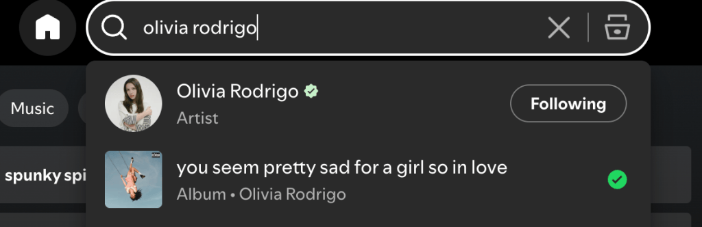


Mapping is important here because users usually have an idea of what they think will happen when they click something. For example, when I click the play button, I expect the song to start. When I search for an artist, I expect to see results related to that artist. When the website responds the way I expected, there is a strong connection between my action and the result.
This also connects to the idea of a mental model. Users have expectations based on their previous experiences with websites and apps. Because of this, designers have to think about what users will assume before they interact with something. UX research can help designers understand these behaviors instead of just assuming that users will understand the interface (Lee, 2017).
Feedback
Spotify also does a good job of giving users feedback. When a song starts playing, the website shows which song is currently playing, the play button changes to a pause button, and the song progress bar moves as the song continues.

This feedback is important because it confirms that something happened after the user clicked a button. Without feedback, someone might wonder if the button actually worked or if I accidentally clicked the wrong thing. Seeing the song playing and the controls change makes the result so much clearer.
Psychology is also connected to this because users are constantly reacting to what the website shows them. Good UX design considers what users expect and how they will respond to what happens next. UX designers can use research and observation to figure out where users may become confused or frustrated instead of simply assuming that the design makes sense (Kintscher, 2016).
Mistakes and Possible Improvements
Even though it is relatively easy, while using Spotify, I was a little confused on how to find new music specifically tailored to me. I thought I would search “songs for me”, but instead you have to click the top button that says browse, and listen to the specific playlists Spotify made for you based on what you might like.
This shows how even a small design choice can cause a user to make a mistake. My expectation did not completely match the way the website worked. One way Spotify could improve this would be to make a “songs for you” button to discover new music fast. Making the control more obvious or adding a label could make the intended action easier to understand.
Target
To move on, Target is a completely different type of website from Spotify. Instead of searching for music, users are usually looking for products, comparing options, and eventually making a purchase. Because of this, Target has a lot of different features that need to guide users through the online shopping process.
Affordances and Signifiers
Just like Spotify, I would say the first obvious affordance is the search bar. Users can type the name of a product into it and find related products. The magnifying glass works as a signifier because it tells users that the field is for searching.

Another affordance could be the product listings. Users can browse through different products and click on them to get more information. As seen below, they are currently promoting fall clothes, and make this very accessible for shoppers.
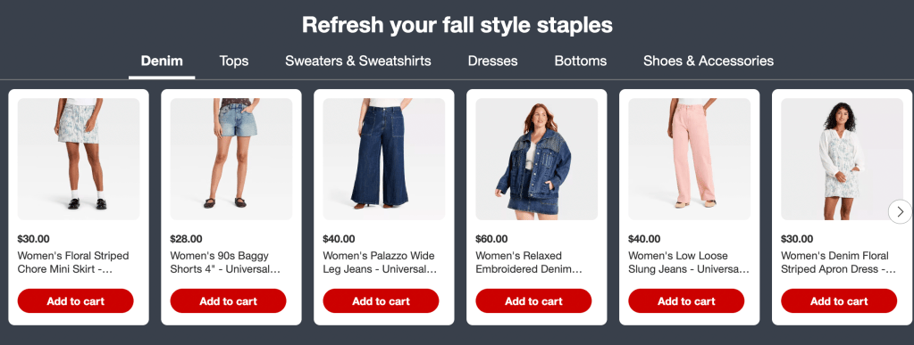
The third example is the “Add to Cart” button. This is probably one of the clearest signifiers on the website because it literally tells the user what will happen when they click it.

These examples make it clear that signifiers don’t always have to be complicated. Sometimes simply labeling a button can be enough to tell the user what they can do.
Mapping and Mental Models
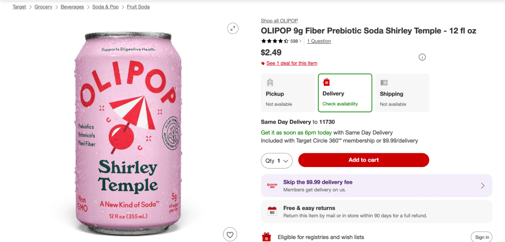
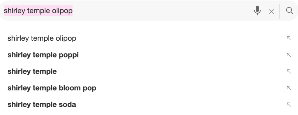
On the website, I searched for a product, looked through the results, used the filters, opened a product, added it to my cart, and then checked the cart.

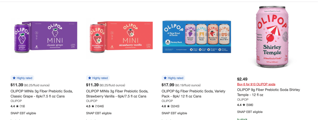
The filters were especially useful for looking at mapping. When I select something like a color, size, or price range, I expect the products shown on the page to change based on that choice.
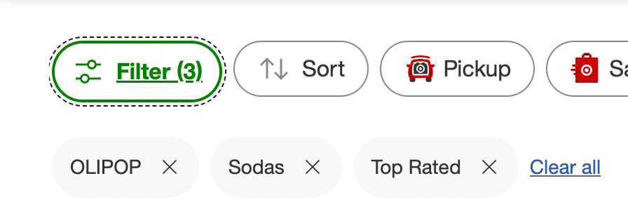
If the website responds exactly how I expect, the mapping makes sense. If I select something and don’t understand what changed, then the relationship between my action and the result becomes less clear.
Feedback
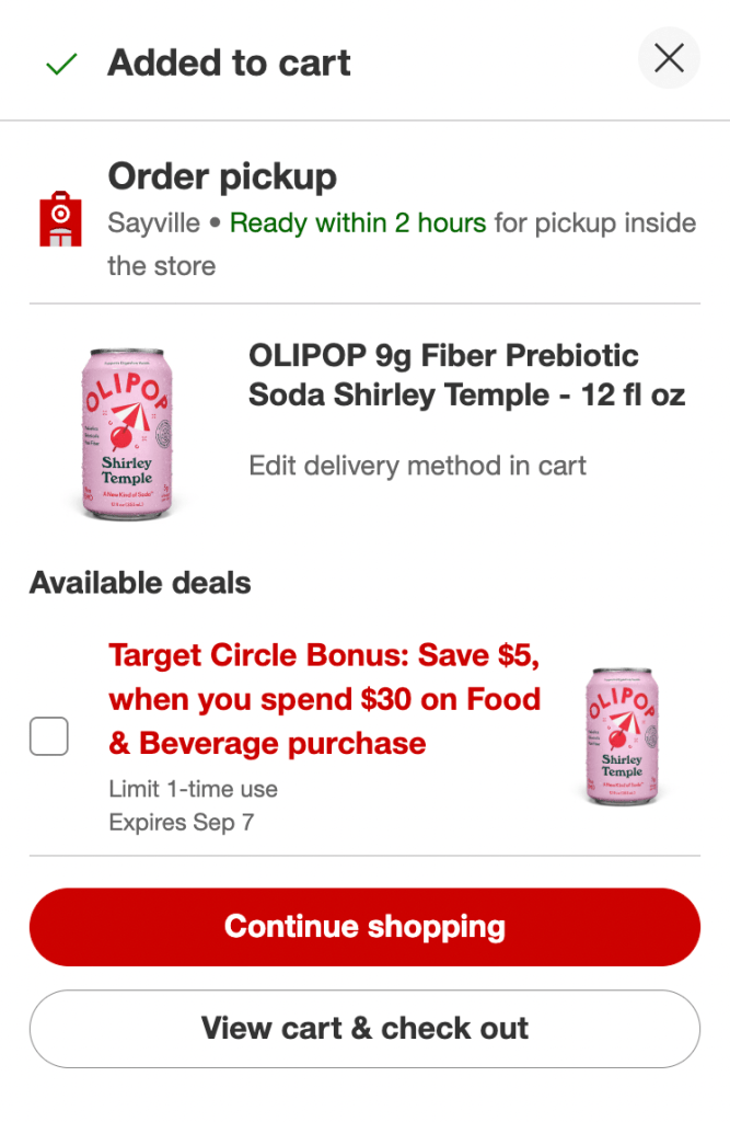
Target uses feedback in several parts of the shopping experience. Search results appear after entering a search, filters change the products shown, and adding something to the cart should give the user some kind of confirmation.
This is especially important when shopping because I want to know that the website actually added the item I selected. If there is no clear confirmation, I might click the button again or check the cart just to make sure.
The emotional side of UX is also important for websites like Target. Research from Harvard Business Review found that emotional connections between customers and companies can influence customer behavior. This shows that UX isn’t only about whether someone can complete a task. The overall experience can also affect how someone feels about a brand and whether they want to continue using it (Magids, Zorfas, & Leemon, 2015).
Mistakes and Possible Improvements
Although an almost perfect UX, while using Target, I did experience a little hardship with the filters. I expected the exact flavor to come up when filtered, but it wasn’t a specific flavor I could filter.
I think this happened because it’s not a very common flavor and not a lot of people actually search it up. A possible redesign would be to have every possible flavor the brand makes, after filtering the brand first. This could make the action easier to understand and prevent users from making the same mistake.
The Differences of Spotify vs. Target
Spotify and Target are very different websites, but they both show how important UX principles are. Spotify focuses more on helping users discover and control music, while Target has to guide users through a much longer shopping process.
Both websites use familiar signifiers to help users understand what different buttons and icons do. They also use mapping to connect the user’s actions to the expected results. Feedback is important on both websites because users need to know whether their actions worked.
The biggest difference is the type of behavior each website is trying to support. Spotify wants users to find music and continue listening, while Target wants users to find products and eventually purchase them. Because of this, the websites use different types of feedback and interactions even though they rely on many of the same basic UX principles.
Looking at the psychology also shows why these principles matter. Users bring their own expectations, habits, and previous experiences into every interaction. A website that understands those expectations can make the experience feel easy and natural. A website that ignores them can cause confusion, frustration, or mistakes.
Why Good UX Really Matters
After looking at Spotify and Target, it became clear that good UX is about more than making a website look nice. A website can have a really good visual design and still be difficult to use.
Affordances show users what they can do, signifiers help them understand how to do it, mapping connects their actions to the results they expect, and feedback lets them know what happened. When all of these work together, users can move through a website without having to stop and figure out every single step.
Psychology adds another layer because designers also have to think about what users expect, what motivates them, and what might frustrate them. The better designers understand their users, the easier it is to create an experience that actually works for them.
Ultimately, Spotify and Target show that successful UX design is about creating an experience that feels natural to the person using it. The best websites don’t make users constantly think about how the website works. They let users focus on what they came there to do.
References
Ishan. (n.d.). The psychology of UX design. UX Collective. https://uxdesign.cc/the-psychology-of-ux-design-859439bc8a32
Lee, G. (n.d.). Having a psychology degree is already a huge step towards user experience (UX). UX Planet. https://uxplanet.org/having-a-psychology-degree-is-already-a-huge-step-towards-user-experience-ux-235c072f9002
Kintscher, N. (n.d.). Combining UX design and psychology to change user behaviour. UX Design. https://uxdesign.cc/combining-ux-design-and-psychology-to-change-user-behaviour-39d27730434a
Han, C. (n.d.). 7 principal psychological phenomena in UX design. Prototypr. https://blog.prototypr.io/7-principal-psychological-phenomena-in-ux-design-1104e09fc974
Magids, S., Zorfas, A., & Leemon, D. (n.d.). The new science of customer emotions. Harvard Business Review. https://hbr.org/2015/11/the-new-science-of-customer-emotions


Leave a Reply